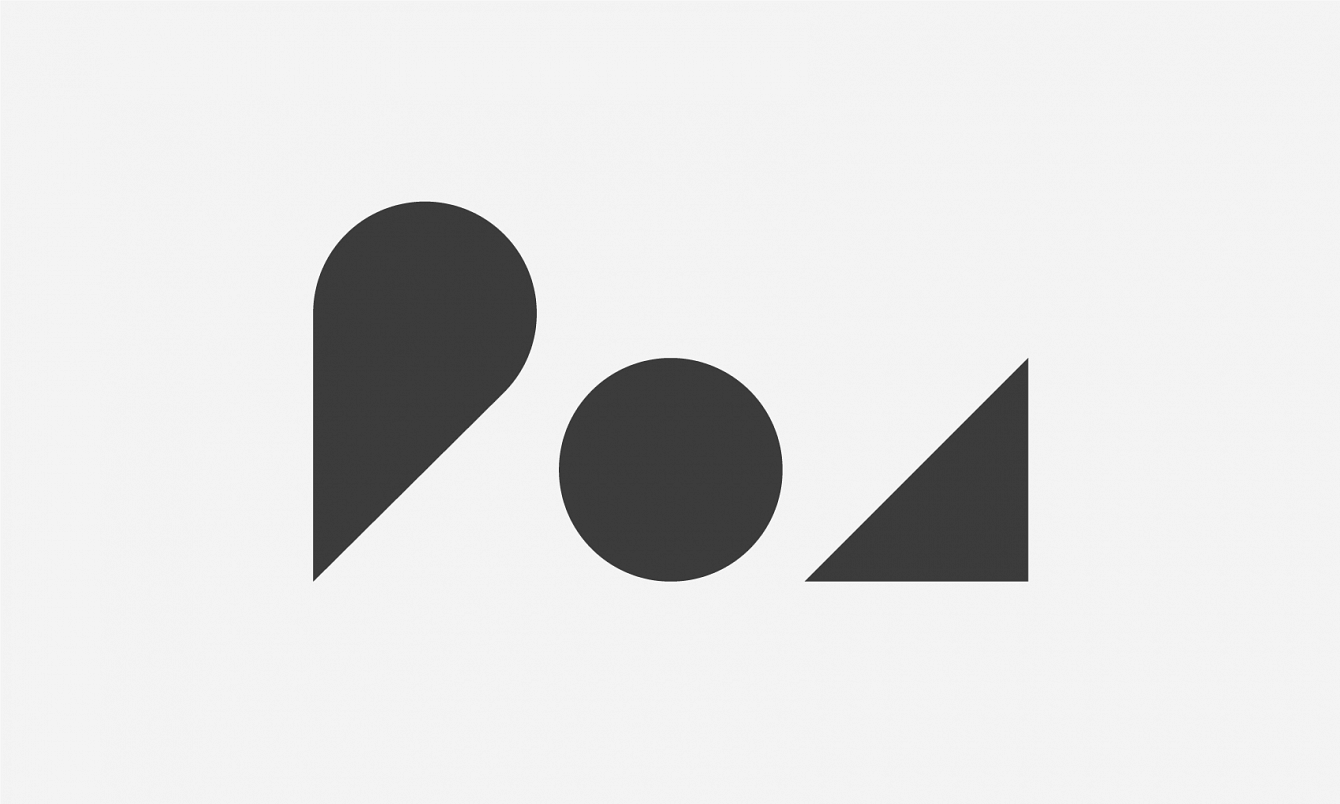
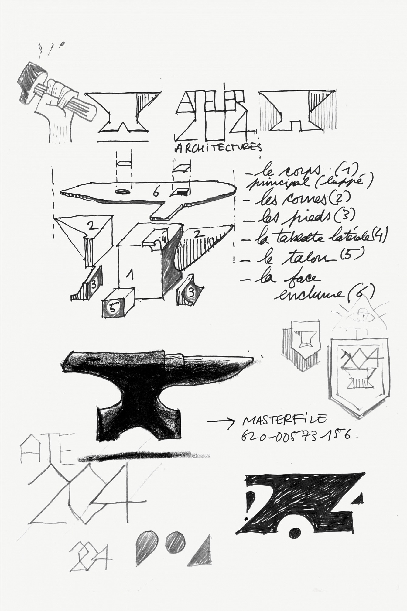
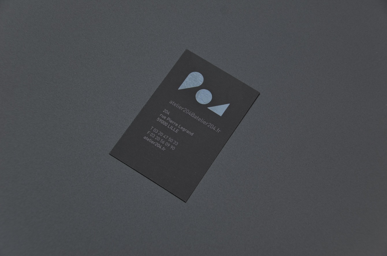
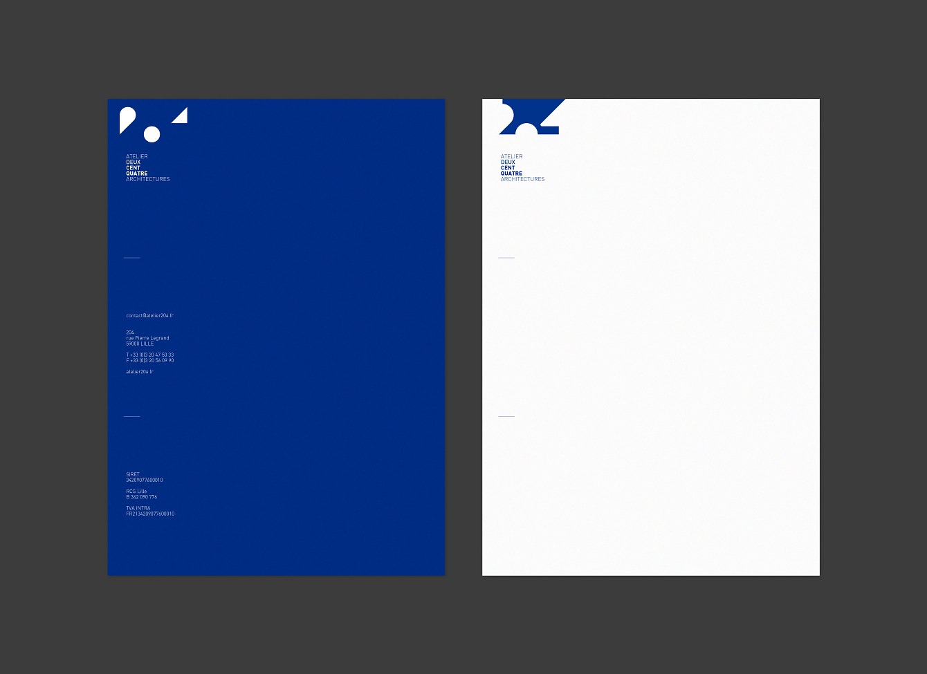
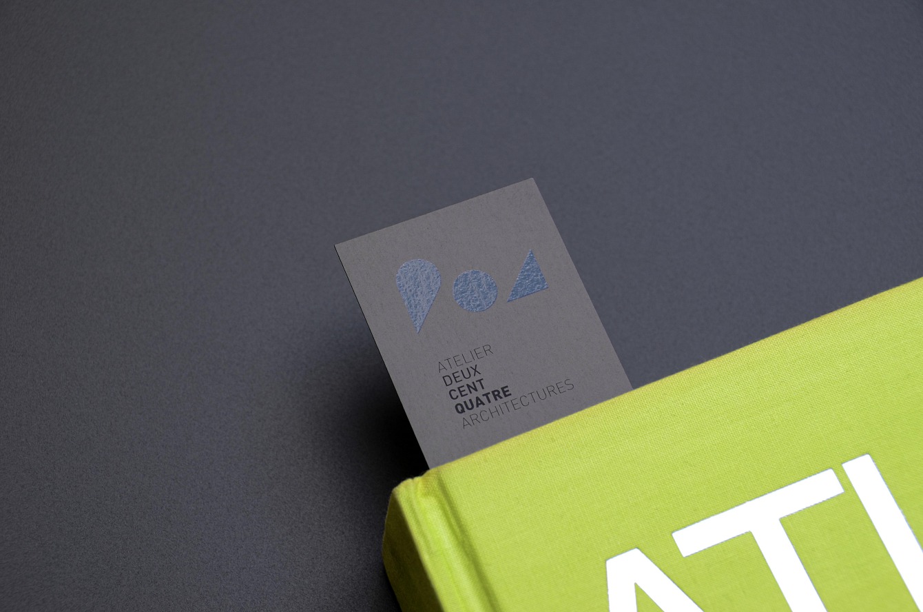
Design of the visual identity and website for Atelier 204 Architectures. The logotype is inspired by the shape of an anvil, a symbol of robustness and work. Reduced to simple geometric forms it gains in lightness. In print, black ink and a glossy varnish give to the visual identity a serious and elegant character.
Client
204 Architectures
204 Architectures
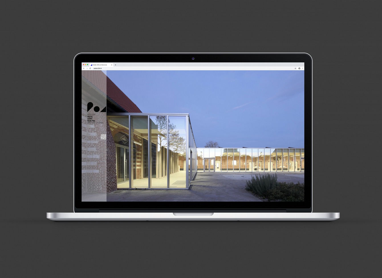
Website
atelier204.fr
atelier204.fr